In 2015, I led the UX design for IFC Films’ new website on behalf of Big Spaceship. IFC Films felt their old website did not properly represent them as a brand, as the distributor leveled up with Oscar-nominated titles like Boyhood. They also felt that their website did not give them enough opportunities to draw users into their considerable back catalog and saw this as an opportunity with a new social media strategy.
Research
From our analytics-guided one-day discovery, we learned how the most viewed template is the film detail page and used that knowledge to prioritize our time in discovery and the information architecture for users. Internally, I developed a set of principles that guided the design for the site, knowing their analytics and that trailers were their strongest marketing tools.
I developed a set of principles that guided the design for the site, knowing their analytics and that trailers were their strongest marketing tools.
Principles
Get users to film information
The two most trafficked templates on IFCFilms. com are the film template and the home page.
To support users whose needs are to find films to watch, promote, or exhibit, all other major pages of the site should be designed to facilitate the findability and discovery of titles in the IFC Films catalog.
Trailers everywhere
Trailers are the strongest promotional tool IFC Films has for their titles. Along the path towards the films they are interested in, users should be encouraged to play trailers at every step of the way.
Promote discovery
The site structure and user interface should help IFC Films create paths between the films users are looking for and more titles in the catalog.
Always in motion
Whether it’s a video, an animated GIF on a short loop, or panning on a high-resolution still image, there should always be an element of the page in motion.
Conversion
The design incorporated trailers and motion into all parts of the experience – even on mobile devices. The new information architecture introduced new ways for their marketing staff to present their deep catalogue in interesting and timely ways.
The new website was nominated for a Webby in 2016.
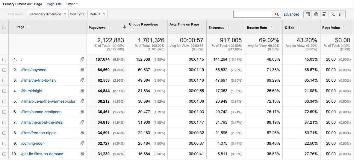
Site analytics revealed that films were the top reason people came to the site. We learned from our one-day discovery phase that site trailers were the top way exhibitors and viewers converted.
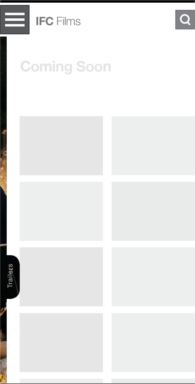
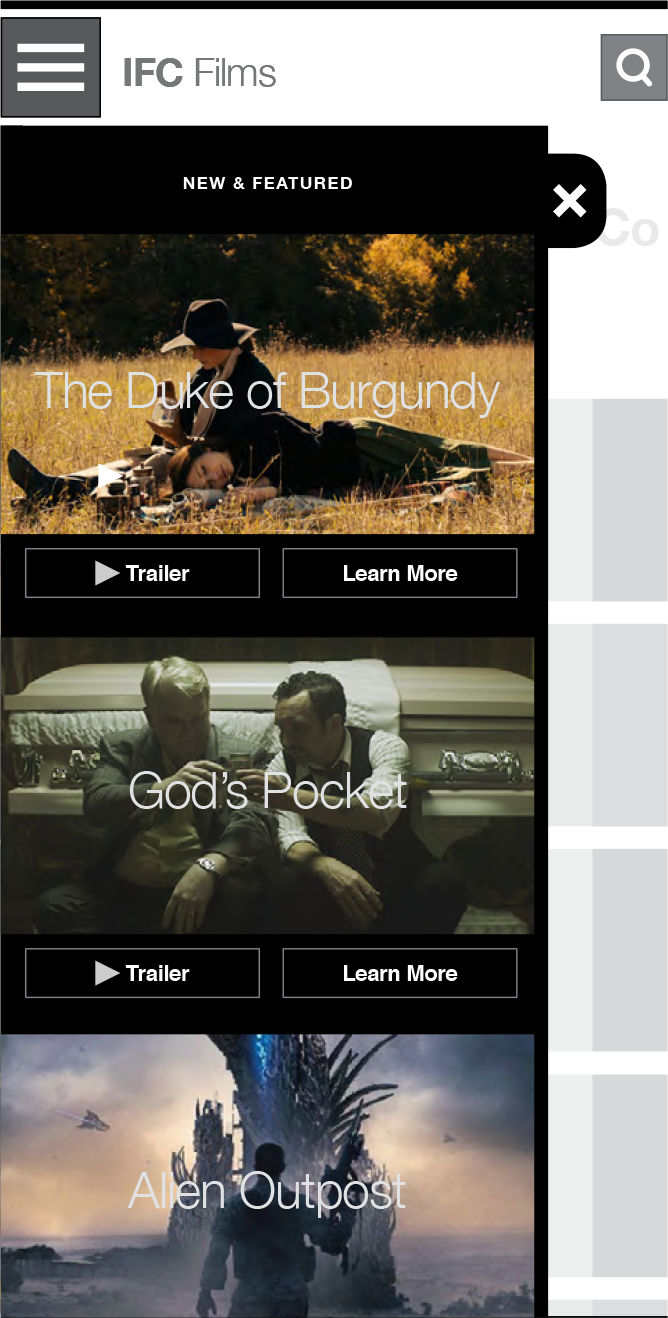
Our strategy pushed trailers throughout the site experience through a user interface element I called the “trailer drawer” – the mobile wireframe for it is shown here.
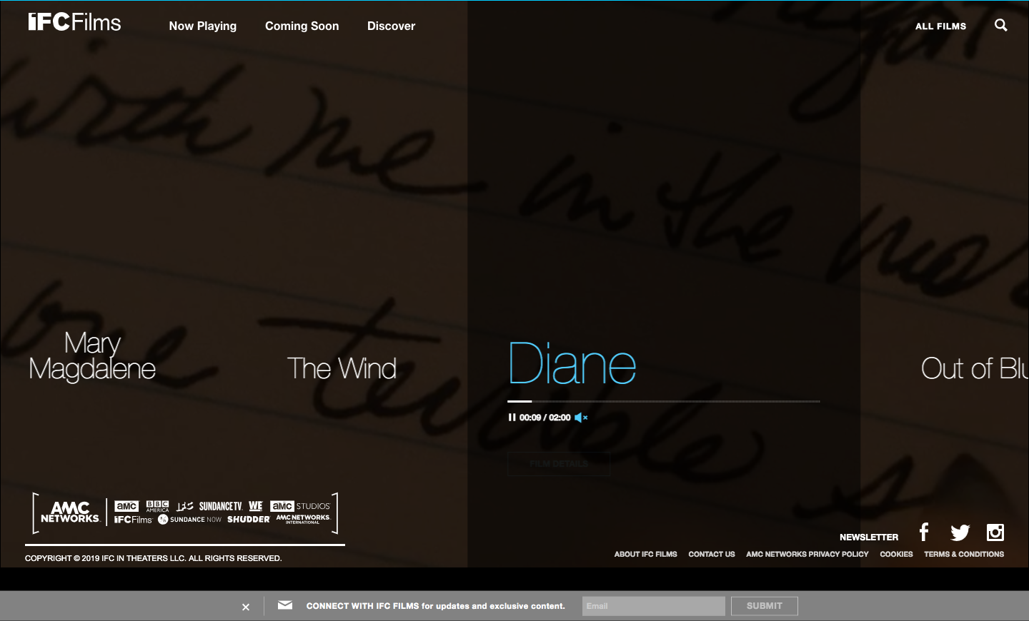
The home page was developed to be a playlist of trailers for titles coming soon and currently in theaters.
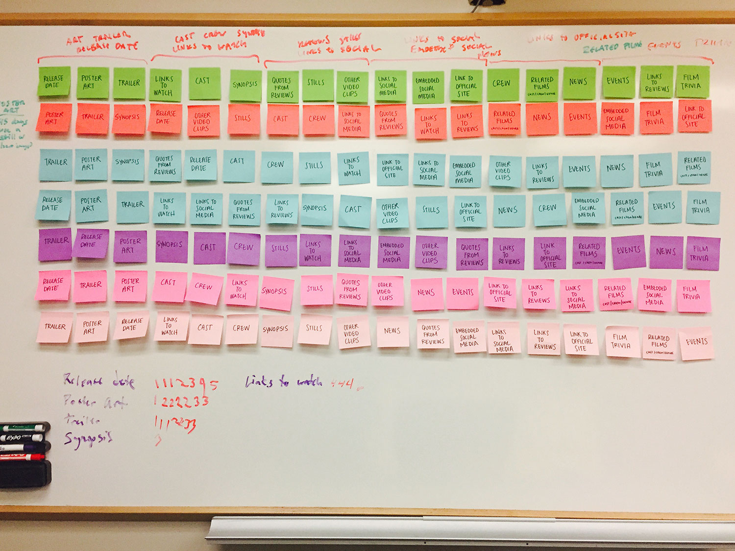
As part of the discovery session, I conducted a card-sorting exercise to prioritize the content that appeared on the film detail page.
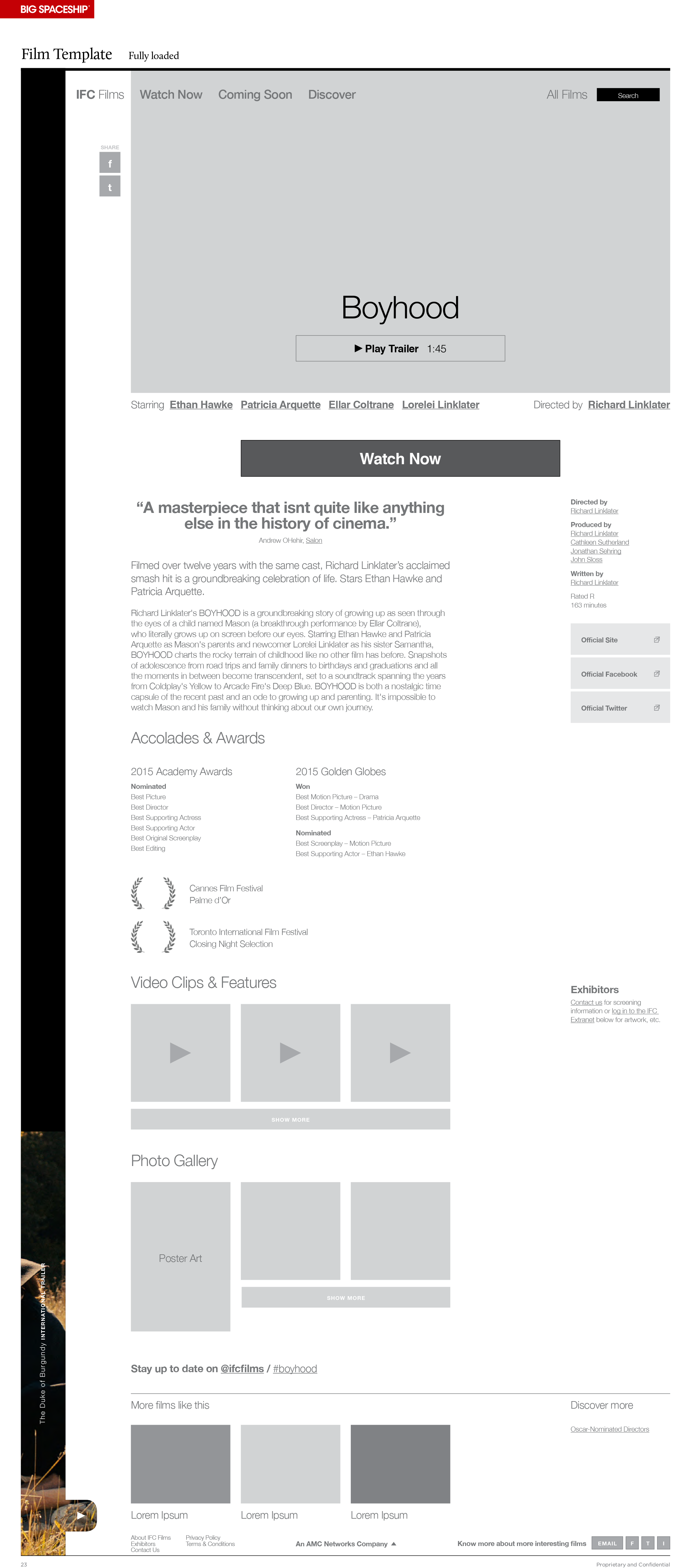
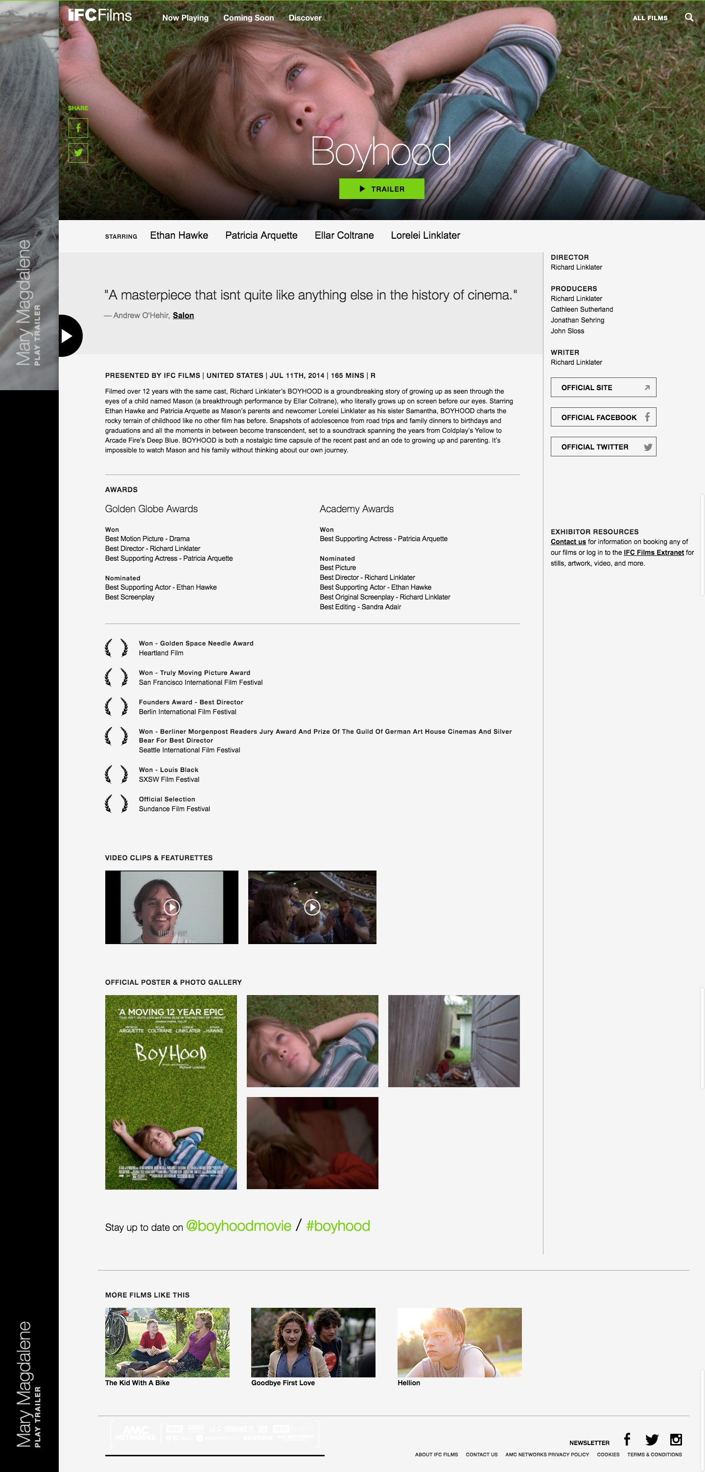
The wireframe and completed film detail page.